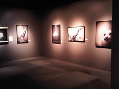
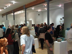
With the NCECA Conference in town, all of the galleries turned the spotlight to their ceramic superstars for First Friday (more about this phenomenon in my next post). I concentrated my expedition around Washington Square, Old City, and Northern Liberties/Fishtown. If asked whether any thematic thread permeated much of the work I saw, carnality comes first to mind.
Bridgette Mayer Gallery was host to
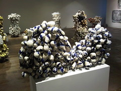
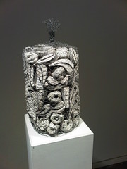
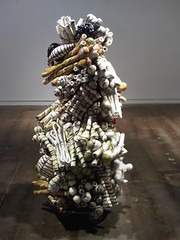
Steve Tobin, whose work had a decidedly aquatic tinge. From his wall of
Single Bang Pots, one could buy individual pieces. I liked the way all of the pots worked as a singular installation, but I was not sure about taking them out of this context. Some of the pots were gorgeous, resembling delicate sea urchin or murex shells, but others were particularly generic and weak as standalone pieces. In Tobin’s
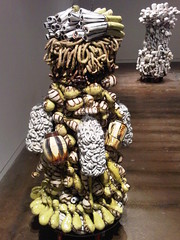
Exploded Earth Series, crater-like vessels held pools of vividly colored glass, akin to petite geyser basins.
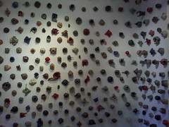 Steve Tobin - Single Bang Pots
 Steve Tobin - Single Bang Pots
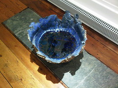 Steve Tobin - Exploded Earth Series
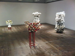
Locks Gallery devoted their entire second floor gallery to
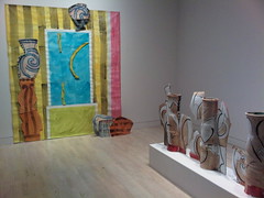
Betty Woodman. I have to be honest—I feel a pinch of guilt in admitting this—her work looks and feels anachronistic, frozen in time as though it just touched down from 1980 or so. I am not a huge fan of P&D (Pattern and Decoration), mostly because I do not consider that the works have aged very well. It was a movement and an aesthetic that served its purpose in the history of 20th Century art, mostly as an exercise in validation for the decorative arts, but one that was more of a means than an end. We all know that in art, process is paramount, but the product should stand on its own merits too. Regardless of my opinion, Woodman is a hero of the medium, whose esteem and reputation are a settled matter, and I respect her achievements.
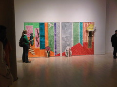 Betty Woodman installation view
Locks also presented some lovely
Kathy Butterly and
Jill Bonovitz vessels on the third floor.
 Kathy Butterly piece at Locks Gallery
At 22 Gallery in Old City (is this a new space or a pop-up gallery?) there was a small mash-up of artwork in varied media by the
Cohoquinoque Crew. I loved this gem by Jo Watko. It may be difficult to tell from the photo, but it is a lectern infested and ostensibly being torn to shreds by locusts.
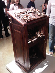 Jo Watko - A Genuine Orator's Podium, 2010
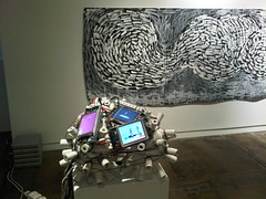
Snyderman-Works Gallery was mobbed, and something of a misfire in its offerings. Visitors are first greeted by
Alex Irvine’s Ugly Jugs (his title, not mine), an array of excessively vulgar attention-grabbers that have been installed in the storefront windows. My problem with these pieces is that they feel too much like movie props or waxwork busts.
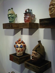 Alex Irvine - Ugly Jugs
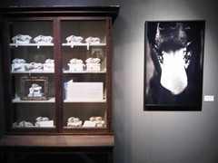
 Snyderman-Works Gallery
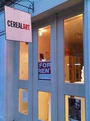
I had no idea that
CerealArt was shuttering its brick-and-mortar gallery to focus on its online sales.
 Wexler Gallery
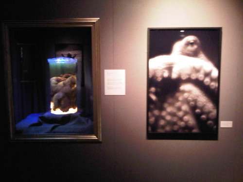
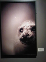
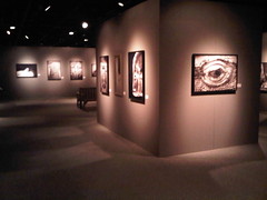
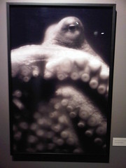
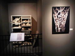
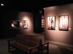
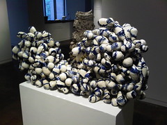
 held my favorite exhibition of the evening,
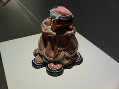
Hermaphrodites: Living In Two Worlds curated by Leslie Ferrin. The works chosen are either literally or conceptually about hermaphroditism, which is to say, they may feature actual intersex protagonists, or they may be hybrids which play with notions of fine art versus decorative art, simultaneously embodying both. I guarantee that you will not be able to shake
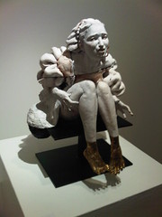
Tip Toland’s Tender Flood from your mind for its unsettling lifelike quality, as well as the diminutive erection he/she unabashedly sports; it struck me as perhaps an aging spin on the ancient Greek mythological figure
Hermaphroditus (the antecedent of our modern terminology), whose youth and beauty have since fallen.
 Tip Toland - Tender Flood, 2010
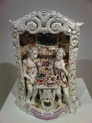 Chris Antemann - Wardrobe, 2009
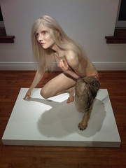
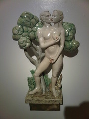 Cynthia Consentino - Undivided, 2010
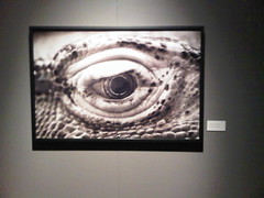
 Kelly Garrett Rathbone - Crocuta Crocuta Marionetta, 2010
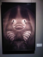
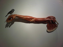
 Dana Major Kanovitz - Infiltrator, 2009
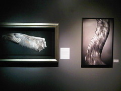
 Dirk Staschke - Premonition, 2008
At
Projects Gallery the exhibition title
To Die For should give some idea as to the curatorial vision. Do not miss the basement level gallery, which contains Todd Leech’s
Drowning. The air is dank, most likely owing to the moisture involved in the work, which adds to the overall milieu of decay. IV drips flow into a tray placed on a hospital gurney, gradually eating away at the unfired clay figurines. I also enjoyed
Kathy Ruttenberg’s Grounded, which gave me drowned-Ophelia vibes.
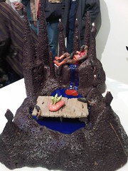
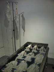 Todd Leech - Drowning

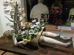 Kathy Ruttenberg - Grounded
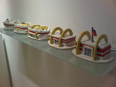 David Furman - The Death of Dessert and the Birth of McDonald's
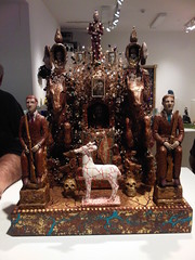 Richard Cleaver - Cult of the Tzar III
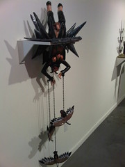
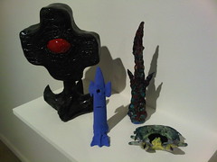
I ended my trek at
Bambi Gallery, where
Paul Swenbeck and Nick Lenker presented the collaborative effort
Man, Myth and Magic. The two oil lamp sculptures are noteworthy highlights. When lit, the flickering flames bolster the dream state ethereality that the selection of works seems to probe.
 Paul Swenbeck & Nick Lenker - Sacrifice

 Paul Swenbeck & Nick Lenker - Lucifer
 Paul Swenbeck & Nick Lenker - Familiars