The Bruce High Quality Foundation have responded to my post critiquing their Teach 4 Amerika stop in Philadelphia. Please read the full text here:
http://teach4amerika.org/uncategorized/if-funding-art-is-wrong-we-don't-want-to-be-right
I was thrilled with their response, even though I still think they are off base. Below is my reply, also posted in the comment section of their blog post:
First of all, thank you for engaging with this topic and taking the time to respond to my critique. I am also glad to hear that I am not the only one who voiced a concern of a similar nature. I could not agree with you more that to be an artist and to present art for the right reasons is a moral imperative. But what I was reacting to in my original post was the impression that I got from your presentation that even mentioning money or economic value is to denigrate the arts in some way, which I thought was either naïve utopianism, to lift one of your descriptors, or textbook contrarianism. You seemed to be more interested in subverting the existing systems that you felt had done wrong by you, rather than trying to improve or repair them, in your advocating for the type of antiestablishment model that BHQFU represents. I found this attitude unhelpful to a larger public and ultimately self-serving.
Now it seems that you acknowledge the importance of public funding for the arts, even though chasing after and distributing public funds for the arts is a labor-intensive process fraught with agonizing bureaucracy, and the recent federal budget battles mean the outlook for the NEA and NEH is hopeless. Are you asking: why even bother? It is not necessary for me to debate with any of the Tea Party/Conservative devil’s advocate playing here, because I know that this is not what you believe. In my own idealist fantasy, public funding the arts would never be looked at as a political issue or a superfluous luxury; it would be universally accepted as providing access to a basic human right.
However, I fully embrace that our free market system means that corporations and individuals can contribute to the arts at the highest level they choose, make stipulations for the use of the money, and demand to be acknowledged in a certain way. I concede that I am a Development person, so something like Target Free Nights (we have these in Philadelphia at the Franklin Institute, too) does not bother me in the way it may rankle you. It is an outward signifier that the leadership of the Target Corporation, or any company that sponsors an event or series, sees the value of the arts and makes a commitment to culturally enriching the lives of people in places where it maintains a business presence. I am not naïve enough to think they are doing it for nothing. They have a right to want people to be aware of their contribution, just as a person who gives money to endow a curator position or pay for a new museum wing wants his or her name in the title. I do not have a problem with this; I do have a problem with an institution accepting money that may have ridiculous reporting guidelines, strings attached that hobble the fulfillment of mission or lead to “mission creep,” or specifically support a program that inordinately benefits the gifting entity. I also disagree with accepting money from a company that has a poor public image or reprehensible corporate values (e.g. BP).
It is not wrong to lead the fight for the arts with the economic argument. You astutely mentioned that in the halls of Congress, the economy has taken precedence over all other debates. Citing the model of the arts as an economic stimulator gets a foot in the door with officials who want to know what good this will do to helping their constituents and to getting themselves reelected. It does not stain the nobler elements of the arts to report on well-researched data that demonstrates the substantial financial impact that the arts generate in a community. The economic imperative is the tactic that works today; the “Great Nation” claim that inspired the NEA’s creation, though still credible, is no longer compelling to those in a public arena. You do not have to soil your hands with championing the economic effects of the arts if you do not want to do so; leave that to arts administrators and arts advocates. But do not reject us outright, because we share motives and goals that have everything in common. If I did not think that the arts are the most fundamentally important thing in life besides physiological human needs, there is no reason that I would be in this profession.
Tuesday, April 26, 2011
Monday, April 11, 2011
The Lives of Charles M. Schulz
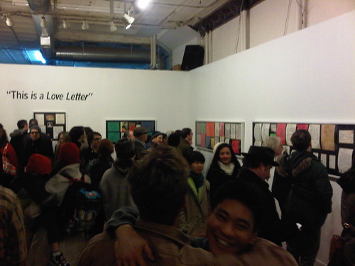
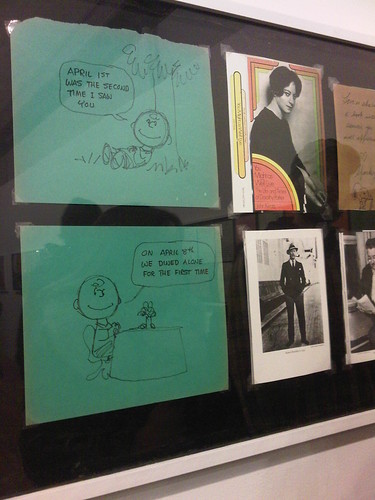
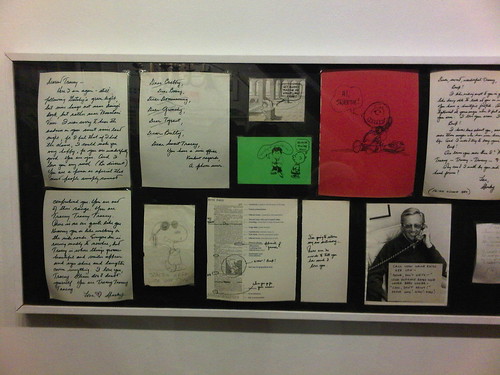
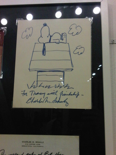
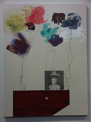
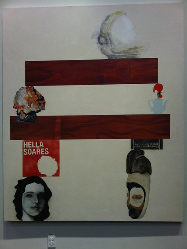
This is a Love Letter: Personal Correspondences from Charles M. Schulz, which spans art, artifact, and ephemera, is unlike any other show I have seen at Space 1026. The title explains the basic premise, but more on that later. It also brought out a more age-diverse crowd than any Space 1026 opening I have witnessed, no doubt due to the interest in Schulz and his Peanuts gang. It was an affirming feeling to see young and old enthralled by these letters. At a moment when omnipresent media force-feeds us predigested junk at a hysterical rate, a character like Charlie Brown can still be a reliable and satisfying staple. There is something incredibly centering about taking delight in these classic characters; for me, it elicits memories of my grandmother, and her love of Snoopy in the funny papers.
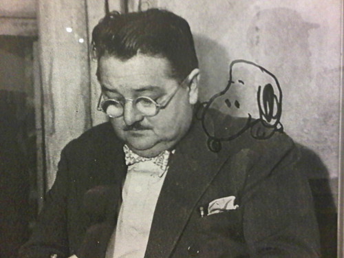
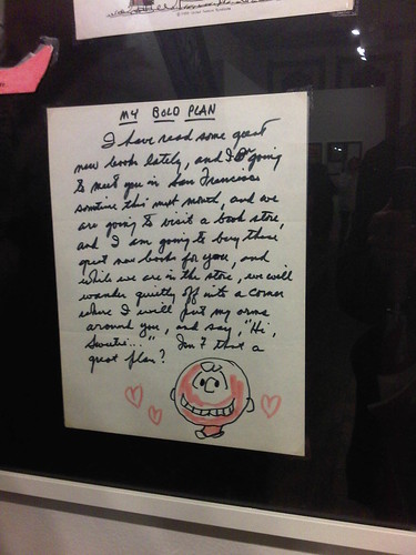
At face value, the letters tell the rise and fall of Schulz’s (or “Sparky,” as he was known to all) love for a young woman named Tracey Claudius in the early 1970s, who was a Philadelphia resident. His prose is romantic to the core, unabashed in letting emotion overflow as he writes repeatedly about his unquenchable and constant desire to see, speak, and be with her. Superlatives abound: his love for her is the strongest and she is by far the greatest. Doodles of Charlie Brown and Snoopy, as well as other one-off characters not among the Peanuts, punctuate some of the letters. Any woman would feel elated to be on the receiving end of such tenderness and constant attention.
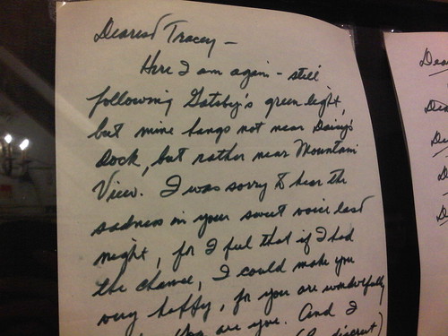
But hidden in plain sight, the letters offer a far twistier story. The collection is effectively presented as is, without much curatorial guidance. A crucial detail goes unspoken: that Schulz carried on his affair with Claudius while he was still married to his first wife (source.) In a telling passage, he writes of “following Gatsby’s green light.” The connotation, taken in context with the rest of that particular letter, would seem to be that Schulz is simply a hopeless romantic; however, comparing himself to the doomed Gatsby, with his unrequited love for Daisy, does not foretell good things to come. If anything, Schulz was something like shades of Jay Gatsby (to his lover and as a cartoonist) and Tom Buchanan (to his wife and others) rolled into one.
Where Charlie Brown and Snoopy pop up in the letters, they act as stand-ins for Schulz’s fragmented psyche, the different parts of an outward persona that he had cultivated. Charlie Brown still plays the loveable loser, blissfully living in the moment and unbothered by worries of a love affair that can have no future. Snoopy, on the other hand, is roguish and consciously detached; the iconic Snoopy alter ego “Joe Cool” appears in a sketch placed near a photo of a smiling Schulz talking on the phone. Who was the real “Sparky”? Both elements, the starry-eyed lover and the smooth playboy, persist in the letters.
Does Schulz’s flawed personal life besmirch Peanuts? Of course not. Attempting to understand him adds depth to his already staggering oeuvre. In coming up with ideas for a daily strip that ran for fifty years, correlation between the man and his art was inevitable, for we write (and draw) what we know. If Peanuts ever seemed uncomplicated, there was so much more bubbling beneath the surface than we ever perceived.
Monday, April 4, 2011
The Bruce High Quality Foundation’s Teach 4 Amerika – An Arts Administrator’s Perspective

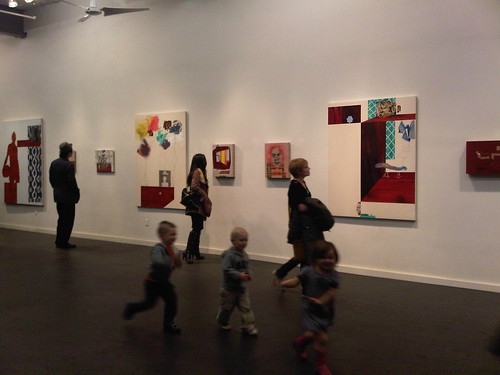
Last week I saw the Bruce High Quality Foundation’s Teach 4 Amerika at Tyler School, and their presentation has unsettled me since. Philadelphia was only the second stop on their breakneck, month-long tour of art schools across the United States in a repurposed limousine/school bus. The tour is aimed squarely at people with BFAs or MFAs (or those who are currently pursuing them) and art school faculty. As an Arts Administration graduate student, I was undoubtedly in the minority of those present. But the BHQF presenter called out arts administrators, particularly those who run art schools, and I feel a response is appropriate.
I first became aware of the Bruce High Quality Foundation last year when their piece We Like America and America Likes Us was included in the 2010 Whitney Biennial. The work consisted of a Joseph Beuys-referencing (or was it Ghostbusters-referencing?) Cadillac Miller-Meteor ambulance, with a video rear-projected onto the windows. The video stitches together iconic film footage, viral online clips, and snippets of news and popular culture, over which a narrator speaks. The piece nails the melancholy and longing of Millennials whose contemporary reality is that we live in an America which was forged through hardship by the Greatest Generation and then laid to waste by the Boomers.
The Teach 4 Amerika presentation is really no different in its tone. The crew at BHQF are very clever, almost too clever, in their manipulation of appropriated media and pairing image with message. A recurring motif is the use of clips from One Flew Over The Cuckoo’s Nest to illustrate the absurdity of the present art school ecosystem. The narrative is built around the story of an archetypal girl who is pursuing her BFA at MICA. You see, BHQF have a bone to pick with the business and economics of art and art schools. It is hard to begrudge them that the commercial art world has its unseemly practices. It is also fact that almost no one who graduates with a fine arts degree will achieve gallery representation, let alone sales robust enough to support a living. But for they would have it, it’s ars gratia artis or nothing. Art is a vocation, a higher calling—a point that I can agree upon—but one which is sullied once money becomes involved; art and business are at polar ends of the spectrum.
BHQF takes exception with the National Endowment for the Arts, picking on its leader Rocco Landesman (an easy target), and its current tagline “Art Works,” i.e. the concept that art can be a generator for local economies. In this city, such a claim is tantamount to blasphemy. Alas, there was no one from the Office of Arts, Culture, and the Creative Economy, the Greater Philadelphia Cultural Alliance, or the Arts & Business Council to go toe to toe with them. At the least, their bone of contention with the economic argument for the value of the arts is appallingly naïve. It is the most formidable tool that those in the arts have against naysayers, particularly elected officials who fundamentally disagree that public money should be used in support of the arts. It is but one part of an arsenal that encompasses and can work hand in hand with arguing for the intrinsic value of the arts, not its mortal enemy.
The tour amounts to little more than preaching to the converted, pandering to manifest frustration about feeling saddled with debilitating student loans to earn an art diploma that will not lead to a sustainable job that can employ the skills learned while obtaining said diploma. BHQF poses many questions but offers no solutions, other than that they have founded BHQFU, a do-it-yourself “university” for people who want to take part in a creative community (they also reject the accreditation system for art schools as another micro-economy that only looks out for its own monetary interest).
Teach 4 Amerika is hipster venting, styled as earnest exploration of critical issues. If it is all a put on, a grand work of performance, BHQF is bamboozling susceptible minds. If they are for real, and represent a truism about the future leaders of our arts communities, all of us are in trouble.
Saturday, April 2, 2011
Soil Kitchen
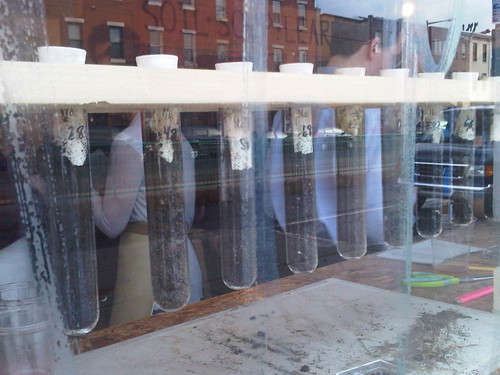
Yesterday evening I attended the opening reception for Soil Kitchen, a temporary public art project organized by the City of Philadelphia Office of Arts, Culture, and the Creative Economy. The collective Futurefarmers—unanimously selected by a panel including Carlos Basualdo, Joshua Mosley, and Winifred Lutz—provided the artistic vision, drawing upon Don Quixote, whose statue stands across the street from its location at 2nd Street and Girard Avenue. They appropriated the windmill, but as a positive model for sustainability and clean energy, rather than the imaginary enemy of a knight-errant. It is tempting to invoke the namesake quixotic moniker, but the project provides a model for community engagement necessary for transforming a dream and an ideal of sustainable living into a practicable reality.
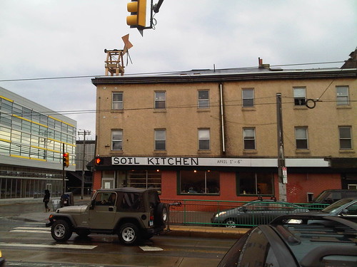
The concept is simple and anyone can participate: bring in a soil sample for analysis and receive a bowl of soup in return, made from fresh, local, and organic ingredients. Empowered with the knowledge about the health and quality of their soil, participants can then take the leap to growing their own vegetables, which can become the ingredients for their own sustainable food.

Visit Soil Kitchen before it closes on April 6!
Monday, March 28, 2011
Looking for Brazil in Chelsea
This month, Chelsea is ripe with Brazilian art!
At Tanya Bonakdar Gallery, Ricardo Basbaum, Carlos Contente, Laura Lima, Maria Nepomuceno, and Thiago Rocha Pitta, five artists from A Gentil Carioca gallery in Rio de Janeiro (which I had the pleasure to visit and wrote about here) are part of a terrific group show.
Also at Tanya Bonakdar, gallery-represented Sandra Cinto is showing new works and a site-specific installation.
Since last August, P.S. 11 has been home to a public mural by Os Gêmeos.
![Os Gêmeos & Futura - P.S. 11 mural [detail]](http://farm6.static.flickr.com/5101/5564688626_86b2b956dd.jpg)
And 1500 Gallery, a relative newcomer to the neighborhood, specializes in Brazilian photography. Vale a visita!

At Tanya Bonakdar Gallery, Ricardo Basbaum, Carlos Contente, Laura Lima, Maria Nepomuceno, and Thiago Rocha Pitta, five artists from A Gentil Carioca gallery in Rio de Janeiro (which I had the pleasure to visit and wrote about here) are part of a terrific group show.
Also at Tanya Bonakdar, gallery-represented Sandra Cinto is showing new works and a site-specific installation.
Since last August, P.S. 11 has been home to a public mural by Os Gêmeos.
And 1500 Gallery, a relative newcomer to the neighborhood, specializes in Brazilian photography. Vale a visita!
Tuesday, March 8, 2011
Unpacking the art of Rubens Ghenov
By chance, scrolling through the March First Friday listings, I cheerfully spied a rare sight: a Brazilian artist showing in a Philadelphia gallery. Rubens Ghenov was to be exhibiting at Artspace Liberti, housed in 2424 Studios. I was unfamiliar with Ghenov and his work, so the night before the opening I read up on him as much as possible with internet research. Born in São Paulo, Ghenov has lived in the United States for over twenty years. This is significant because it is enough time to have become fully assimilated as an American, though his work retains a primarily Brazilian identity.
The exhibition, ie: Brazilein Chaekkorias, rotted one note, on view through April 24, comprises nine paintings and an audio component. The elaborate (and entirely mythological) historical narrative that informs the selected works, providing the conceptual backbone of the show, begs explanation. Ghenov relies on a triangle of cleverly contrived characters who are vaguely reminiscent of actual people: Ignácio Bira Puera, Norah Lheo, and Milton Jaula (Gaiolinha). Ignácio Bira Puera was the author of a forgotten volume called O Centimetro Fantasma (The Ghostly Centimeter), a chapter of which Ghenov cites as a direct influence on the paintings. Norah Lheo translated the text to English, providing both the artist and Milton Jaula with a copy of the book. Jaula, whose sample-heavy music was looped at the opening (the track can be streamed here), was also influenced by Bira Puera’s writing.
What does all of this mean? Ignácio Bira Puera seems to be a nod to Ibirapuera Park in São Paulo and a reference to Ghenov’s Paulistano childhood. The name Ibirapuera has been preserved from the Amerindian Tupi-Guarani language word for “rotten wood” (more on the significance of trees and timber later). He resembles some of the Modernist thinkers in Brazil during the first half of the twentieth century. Norah Lheo undoubtedly refers to Nara Leão, Bossa Nova turned Tropicália chanteuse. Milton Jaula is a play on the name of composer John Cage (full name: John Milton Cage, Jr.; “Jaula” translates to “cage” and the nickname Gaiolinha is a diminutive form for the word “seagull”). Jaula appears in one way to be an alter ego for Ghenov. And, although I’m speculating, he also bears some resemblance to Rogério Duprat, the man who pioneered the sound of the Tropicália movement’s most iconic songs. Taken altogether, this fascinating mélange of Brazilian cultural allusions sets up the parameters of a parallel universe which become Genov’s playground.
The title of the exhibition cites chaekkori, a Korean term for the depiction of items like books, brushes, or artwork, which denote erudition. Ghenov’s paintings contain similar elements, albeit ones he has extrapolated from Brazilian culture and then tweaked in some way. All but one of the works contains a deep crimson woodgrain motif of Pau-Brasil (known in English as “Brazilwood”), an emblematic tree that today is ripe with national connotation, and the history of which as an export product was essential to the colonial development of Brazil. Ghenov spoke to me about the wood acting like shelves within the picture plane, on which he propped other things.
Within the paintings, he turns popular culture on its head, remixing it in a way similar to the accompanying sound collage that plucks from Bossa Nova, Tropicália, and MPB. Adding to the complexity, Ghenov overlays references to “high culture”. In Brazil, as well as much of Latin America, there has traditionally been less of a preoccupation with distinctly segregating high art from popular art. Nineteenth century Emperor Dom Pedro I is styled as Chico Buarque de Hollanda on the cover of his third album. A grid that calls to mind Hélio Oiticica’s Constructivist-period Metaesquema paintings maps the face of Gal Costa—both of them key players in Tropicália.
![Rubens Ghenov - On the occasion of the Emperor's exile [detail]](http://farm6.static.flickr.com/5059/5503349981_a08b8cf6d3_m.jpg)
And in the remarkable Astronauta da Saudade, the final painting of the installation, he ties together five hundred years of Brazilian history. The astronaut is held aloft on pillars of Brazilian chaekkori and shelves of Pau-Brasil, while simultaneously being removed them as though they are on Earth, far below his space orbit. Saudade, the memory and the longing, is what remains for him.
Sunday, January 23, 2011
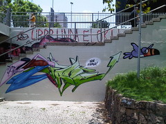
Street Art in Rio
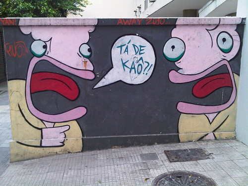
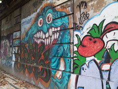
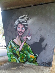
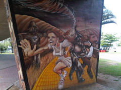
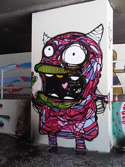
São Paulo may be the undisputed capitol of street art in Brazil—if not the world—but Rio de Janeiro is no slouch by comparison. Graffiti is ubiquitous, whether in the poshest or most marginal areas of the city, like a visual leitmotif with give-and-take relationship to urban life in Rio. Before my most recent visit, I attempted to educate myself as much as possible about the local scene. The book Graffiti Brasil by Tristan Manco, Lost Art, and Caleb Neelon, became my bible thanks to its information about the history, terminology, styles, and key players in the vast world of Brazilian graffiti (though understandably its focus is on the Paulistano variety). As a reference it is peerless, because there are few published works in English on the subject. In my own writing I realize that I may mangle some of the nuanced distinctions between things such as throw-ups, bombings, and pieces (or murals), while altogether ignoring the confounding debate over street art versus graffiti art.
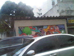
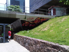
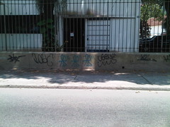
Graffiti is as integral to the landscape of Rio as the mountains and the sea, and it is everywhere, from locations where it is officially sanctioned by the municipal prefecture, to places where it is an illegal act of transgression. I spent most of my time in Zona Sul, more specifically areas like Lagoa, Jardim Botânico, Gávea, Botafogo, and Ipanema. The more graffiti that I saw, the easier it became to discern the different styles of certain prolific artists. Some works are signed, either by the individual artist or the graffiti crew, but often they are unattributed. It was only after I returned home to do research, especially in the graffiti groups on Flickr, that I identified the artists whose work I had photographed.
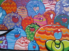
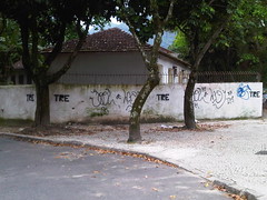
Fleshbeck Crew (usually shortened to FBC) is one of the more prevalent groups. I continuously noticed the work of crew member Toz for his cartoony, cat-like creatures. Road, another member, had also laid claim to many areas with his DJ1 character. In addition to their recognizable characters, I think that the color sensibility of this crew sets it apart, by bringing together blocks of bold, contrasting shades.
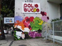
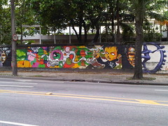

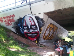
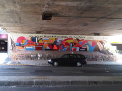
Infrastructure provides the best canvas for graffiti art, and the wall enclosing Joquei Clube along Rua Jardim Botânico is a nearly kilometer-long bonanza of countless artists. It is work that has been done legally, disregarding the tags written over some of them (a sign of disrespect), hence the scale and level of detail in these pieces.

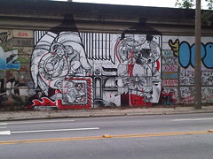

The overpass at the northeastern corner of the lagoon is another excellent place to see a great assortment of pieces.
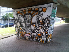

Avenida República do Chile in Centro also has an impressive concentration of work.
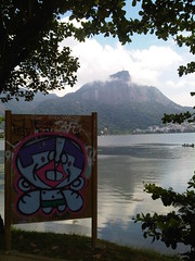
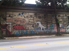
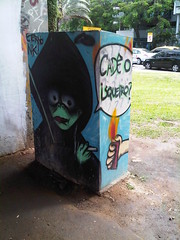
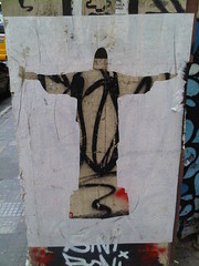
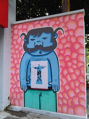
I did not see many paste-ups, except for this recurring silhouette cut-out of the Cristo Redentor statue, typically stuck over already graffitied walls.
Pixação (also spelled pichação) is another strain of graffiti, akin to tagging but with very specific criterion. The pichador writes his name, the name of his crew, or the name of his grife (a larger amalgamation of crews). The authors of Graffiti Brasil explain, “There are some visual rules—for example, the letters of the tags should be uniformly tall and wide, meeting an invisible and straight guideline at the top and bottom of the name. The letters should usually be separate from one another. In addition, the breaks and bends of the tag’s letters should (again, normally) be at a consistent elevation (e.g. two-thirds of the way to the top of the letter).” But pixação never stops at a solitary tag; it is a uniform repetition of the same tag at regular intervals. It is most commonly associated with São Paulo, but “in Rio de Janeiro, these spray-painted tags are small, with tight, looping and often symmetrical forms.” Depending on the thickness of the letters, spray cans or rollers can be used. This video produced by Coolhunting is a first-rate primer on pixação.
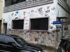
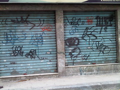
Pixação is aggressive and nihilistic. It is loathed my most people as the lowest form of vandalism, and its practitioners do not think of it as art. If anything, it is more of a political act, an in your face assertion of personal existentiality by people otherwise invisible to the ruling class. When an entire building has been scrawled with pixação, society cannot ignore it. Most of the pixação I saw in Rio falls into the category of agenda, where street-level walls become filled top-to-bottom with different tags. In the hierarchy of pixação, agenda tags are not well-respected. It is the heaven-spots, e.g. the tops of buildings or precipices where the pichador must actually risk his life to access (watch this trailer for the documentary PIXO to see hair-raising footage of climbing pichadores), that are of high status. Also impressive is when a crew can bomb an entire building. The only such example I saw was in Niterói, but the internet is littered with photos of buildings that have been fully hit.
I found pixação fascinating, rather than odious—perhaps I would feel another way if someone had bombed my building. It takes the dedication of an artist, even though it exists in a no man’s land at the periphery of art. In this regard, I have a sense of respect and awe for the pichadores. I suppose that, strictly speaking, they do not care whether you love or hate what they do, as long as it provokes a passionate reaction.
Subscribe to:
Posts (Atom)