Sunday, March 28, 2010

Whitney Biennial, part 2


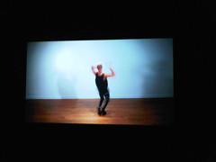
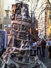
Rashaad Newsome - Untitled, 2008

Before it gets too far removed from the fact, I have a few more thoughts to share on the Whitney Biennial 2010. I was enraptured with Rashaad Newsome’s pair of videos Untitled and Untitled (New Way). He pulls Ballroom culture out of its natural habitat, having two performers energetically vogue in small, blank rooms. The soundtrack is muted, centralizing focus on the stories that these young men narrate with their balletic movements. This vacuum of extraneous sight and sound strips away any element of camp, leaving only the beauty and art of the physical performance. Though still primarily underground and not seriously respected when compared to more institutionally sanctioned forms of dance, voguing is becoming more visible in mainstream media (think of TV programs like America’s Next Top Model and RuPaul’s Drag Race), so placing it in this museum setting is not as transgressive as some might be tempted to think. Spend time watching both videos in their entirety; they are each under ten minutes in duration, and well worth a dedicated viewing.


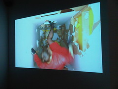
Kate Gilmore - Standing Here, 2010

Kate Gilmore’s Standing Here is another isolation-chamber type drywall demolition derby, similar to what I saw from her at ICA in Philadelphia last year, this time transferred to a narrow vertical shaft setting. Her performances and the accompanying videos are becoming progressively slicker in their production values. I am still digging her work, along with its gender complexities which I will not delve into here, though I must declare that it no longer thrills quite like the unpolished DIY sensibility of earlier projects, such as Anything…, where she builds and then scales a harrowingly rickety tower of furniture, or Main Squeeze, in which she attempts to worm her way through a ridiculously narrow scrap-wood tunnel.


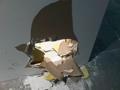
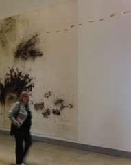
Gilmore's point of entry/escape

Without going into too much detail, here are a few of my other favorites: Tauba Auerbach’s exquisitely bemusing “fold paintings”; Aurel Schmidt’s minotaur, which nicks Giuseppe Arcimboldo’s calling card, substituting cigarette butts, beer cans, and other grimy trash; and the delectable ink-bleeds of Storm Tharp’s portraits.


Piotr Uklański - Untitled (Red Dwarf), 2010 and Untitled (The Year We Make Contact), 2010


Piotr Uklański’s contributions Untitled (The Year We Make Contact) and Untitled (Red Dwarf) are not so much great, or even good, as they are hulkingly inescapable; I was strangely ambivalent about them.

My least favorite pieces were predominantly those with a political bent, whether they championed hope for a brighter future or portended America’s theoretically inevitable demise. Jessica Jackson Hutchins’ Couch for a Long Time, or the “Obama couch”, is unrepentantly partisan; but to me, the greater sin is how corny it feels, simultaneously existing as art comfort food for liberals, anathema for conservatives, and a big “huh?” for centrists. Bruce High Quality Foundation’s We Like America and America Likes Us is something of an open love letter to our nation, ruminating on whether the affection is or is not mutual, that while ostensibly being the work of a younger generation of artists, somehow felt as though it panders more to a Boomer crowd through its selection of appropriated footage and images. I appreciated the Beuys allusion in the use of the vehicle and referential title; though ultimately, I grew cynical of the video component as it wore onward (you can watch the whole thing here). Hung within the same gallery, Lorraine O’Grady’s dueling Charles Baudelaire/Michael Jackson portraits were another dislike of mine. The pop culture topicality of selecting not one, but two MJ referencing works (the other being Daniel McDonald’s gimmicky, smoke-spewing sculpture in the lobby), smacked of a curatorial laziness that felt out of step with the overwhelming majority of Francesco Bonami’s and Gary Carrion-Murayari’s choices for the Biennial.

And for the worst in show? Josephine Meckseper’s stultifyingly unsubtle Mall of America (brief snippet here). I couldn’t take much of its plodding, monochromatically filtered, and ominously clichéd shots of rampant American consumerism, done no favors by a blood-curdling, eardrum-rattling soundtrack. Recurring flashes of “sale” or “discount” placards, shoppers in slow motion, and deafening noise? I get it: America and its rampant consumerism are morally bankrupt, enslaving and ultimately dooming us. Thank you for your “enlightened” outsider perspective (Meckseper is German by birth, now living in the U.S.A). Maybe this unflattering portrayal is how we truly appear to the rest of the world, if not what many of us see when hold a mirror to ourselves. But did I need this browbeating artwork to tell me what I already know? And can it really be possible that the video is almost thirteen minutes in length? Watch thirty seconds of this one and you’ve seen all you need to see.

Saturday, March 27, 2010

Barbarian Invasions at Crane Arts


Wolfbat Studios - Viking Ship, outside Crane Arts on March 26, 2010

With Philagrafika 2010 entering its final weeks and SGC International in town, what a remarkable time it has been for print in Philadelphia! Wolfbat StudiosViking Ship sat in the parking lot adjacent to the Crane Arts Building last night, poised to parade through the city streets, bringing its pastiche of donated art to the people, and to champion print’s ascendance to the vanguard of Philadelphia’s art scene. This was not a hostile takeover, as the militarism inherent in a Viking theme might suggest; it is a movement that has grown, building momentum through the dedication of artists and organizations like Philagrafika. Think of this as the victory procession.


The Viking Ship also got me thinking about Duke Riley (incidentally, presenting his current project Reclaiming the Lost Kingdom of Laird at The Historical Society of Philadelphia). Last summer he staged Those About to Die Salute You, a modern reinterpretation of an Ancient Roman naumachia (naval battle). An amphitheater, such as the Coliseum, would be flooded so that naval battles could be staged for public entertainment; think of them as gladiatorial combat on boats. Riley’s project pitted teams representing different museums in New York against one another, battling proudly for their respective institutions. If only we could convince Riley to restage this participatory event here in Philadelphia! Perhaps, instead of culling teams from museums, representatives from different art media could battle for dominance, giving print the chance to defend its newfound preeminence.


Video by Keith Ozar

Thursday, March 25, 2010

Drive By Press at The Print Center


Last night I attended the wonderful Drive By Press event at The Print Center. The 1600 block of Latimer Street was closed to traffic, making way for their mobile printing stations. When I arrived, the Tower of Babel sculpture was well underway, pieced together from donated prints by local artists. Aficionados of the medium were lining up to get t-shirts, other garments, and bags printed at either the woodblock or the silk screen printing station.


There was also the innovative “Dumbo” press, built from a repurposed playground rocking horse, which was given its maiden voyage by Joseph Velasquez of Drive By Press. As the evening wore on, the crowd—a healthy mix of locals and visitors attending the Southern Graphics Council convention—swelled in size, filling the street, until the finished Tower was ceremoniously hoisted to cheers and applause. A selection of photos and video are posted below, with more available on my Flickr and Vimeo pages!


Tuesday, March 23, 2010

Cai Guo-Qiang at PMA


Cai Guo-Qiang - Autumn and 99 Golden Boats

I’ve been cohabiting with Cai Guo-Qiang’s exhibition at The Fabric Workshop and Museum for nearly four months, until it closed yesterday. But I only just took the time to see his installation at Philadelphia Museum of Art. Light Passage comprised four gunpowder drawings—Winter, Spring, Summer, and Autumn. Suspended from the ceiling was 99 Golden Boats, a series of diminutive vessels winding the length of the gallery. They were installed in the Honickman Gallery at PMA, part of an arterial corridor that runs through the modern and contemporary wing.


Cai Guo-Qiang - 99 Golden Boats

The gunpowder drawings themselves are perfectly decent examples of the work for which he has become most famous. Having seen the man lay out and ignite a drawing in person is truly a once-in-a-lifetime experience. These particular pieces contrast the energetic forms Cai achieves with freehand-scattered gunpowder with the crisper-shaped figures attained by outlining the gunpowder with stencils. However, I believe that the works have been selected specifically for what they represent and how they fit within the themes guiding the project, rather than for their individual artistic merits. The leitmotif at both institutions has been lifecycles and the passage of time (in honor of the late Director Anne d’Harnoncourt), so what better way to represent this than with a series of drawings about the four seasons? Well, for one thing, it feels overtly facile and too darn literal.


Looking towards Light Passage with 99 Golden Boats hanging above

On the other hand, I liked the selection of 99 Golden Boats. They chart a snaking course which begins outside of the gallery, leading the viewer in and through the space, constantly looking up. If anything, they do not resemble boats as much as gilt cephalopods, propelling themselves in sequence through invisible liquid. The work has a light, energetic optimism—one can imagine these boats borne upon some imaginary stream as they head forward to a destination unknown. Its obvious counterpoint is Time Scroll at FWM, the manmade river holding his gunpowder drawing about Anne d’Harnoncourt’s life which the flowing water is meant to wash away with time.


Cai Guo-Qiang - Fallen Blossoms: Explosion Project, December 11, 2009
Video by Carlos Avendaño


The direct contrast of these two works solidified for me the distinct overall tones at each respective institution in the collaborative effort to host Cai in Philadelphia. The feeling at PMA came over as invigorating jubilance: the Fallen Blossoms explosion event in December celebrated Anne and her life, expressed in a transient, violent, and masculine burst of energy; the gallery works also felt full of the same lively spirit. Whereas the exhibition at FWM was, by comparison, more solemn and elegiac: the river mournfully wiped away memories of Anne, oblivious to the degradation it inflicted; the tapestry weaving studio offered meditative visual representations from her life, created through an inescapably deliberative process and with an age-old medium traditionally ascribed to feminine gender role.

For my previous post on Cai Guo-Qiang at FWM, click here.

Sunday, March 21, 2010

The future home of The Barnes


The Barnes construction site, March 2010

While out enjoying the wonderful weather today, I got a good look at the future site of The Barnes Foundation. It may only be a pit in the ground right now, but I am psyched for the day that The Barnes will open on The Parkway. I don’t care what the wingnuts think, or how loud they shout. For the good of the public and the future of the institution, The Barnes belongs in Philadelphia. Come quickly, 2012!

Thursday, March 11, 2010

Whitney Biennial, part 1


George Condo - The Butcher and His Wife

Confessions out of the way upfront: this was my first visit to a Whitney Biennial. I have read many of the reviews and much of the press surrounding 2010, and it seems like this was as good a year as any to be initiated to the ritual. I started at the top of the museum with Collecting Biennials, built around works shown at either the Whitney Annuals (now-defunct) or Biennials. The guiding principle for curators Francesco Bonami and Gary Carrion-Murayari was to engage the viewer’s hindsight on how relevant or dated these works may seem to us today, and how they were contextualized within the Annual or Biennial of their debut. I found the concept to work well, as there are some wonderful works to be seen. Looking back, I tended to gravitate toward their selection of mid-century works. My highlights include: George Tooker’s The Subway, in which the neurosis of Cold War era paranoia looks no different from high-tech snooping fears in the 21st Century; Vija Celmin’s Heater from 1964, the perfect bare-bones appliance for our cash-strapped times; Larry Clark’s Tulsa series, in which I saw prefigured how current reality television shows broadcast the grinding hopelessness of addiction direct to our homes, albeit devoid of any artistic merit; and Lee Bontecou, of whom I can’t get enough in general. One new work from the 2010 show, George Condo’s The Butcher and His Wife, is slipped into the mix. As for this bronze sculpture, while its back story is that of violent coitus interruptus between a butcher and his wife, call me crass but for some reason I couldn’t help but see, at least compositionally, flashes of Michael and Bubbles.

I came away with two clear favorites from 2010: Pae White’s Untitled, Still and Kerry Tribe’s H.M.


Pae White - Untitled, Still

Perhaps the sexiest work of the entire Biennial—I mean that in the most complimentary way possible—the tapestry’s translucent coils of smoke conjure images of cinematic noir and its monumental scale allows the viewer to get lost in her dreamlike vision. Are mere plumes of smoke worthy a medium of such grandeur of size and status, once reserved for royalty? In the wall text, White speaks of “the cotton’s dream of becoming something other than itself.” I agree; the work totally transcends the sum of its physical parts, propelled by its unabashed gorgeousness.

Kerry Tribe’s H.M. is a touching fictionalized film piece about a real-life man who was limited to twenty seconds of short term memory because of an experimental surgical procedure meant to remedy debilitating seizures, in which a portion of his brain was removed. The film is shown in duplicate, with two projectors that are synchronized twenty seconds apart to simulate the span of H.M.’s memory. The true strength of the piece lies in its humanity, especially the actor who gracefully portrays the afflicted titular character with an earnest, folksy geniality that belies his frustrated cognitive function. It is his disarming performance that allows for an honest meditation on the themes of memory and perception.

(Please stay tuned, part two will follow shortly...)

Saturday, March 6, 2010

Tim Burton at MOMA


Tim Burton - Balloon Boy

Quite accidentally, on the weekend prior to Alice in Wonderland opening, I visited the Museum of Modern Art, where I saw Tim Burton’s solo exhibition. The affair was predictably overstuffed with works of wildly varying qualities. Adding insult to injury, crowd flow and accessibility of the works to even able bodied patrons lived down to my expectations. I do not question the museum-worthiness of his work up to a point. That said, there are some stinkers in the mix. You can certainly see how his ideas evolve and make their way into the films. I considered his technical skill to be admirable and I kept thinking about what he could do with print media, especially etching. But as stand alones, most of the works are sketches, and by definition, ideas which are not yet fully formed, only reinforcing the fact that Burton’s true art is the finished film. Of the film pieces installed in the gallery, mostly lesser known shorts and animations, they were again hard to access and devote one’s attention because of crowd overflow.

Some of the sketches are intriguing, and codify the influence on his work of movements such as Expressionism, Surrealism, and art of the Wiemar Republic. I also found myself constantly reminded of Odilon Redon, himself the subject of a wonderful retrospective at MOMA five years ago. There were groupings of studies for weird and deranged characters that never made the cut into a film, reminding me of Leonardo’s studies of grotesque heads and even Franz Xaver Messerschmidt’s character busts. Burton’s debt to these art historical antecedents is tempered by the way he has extrapolated from them a style wholly his own.

As for the area that left me most disappointed with the overall artistic and curatorial quality of the show? The display of costume pieces and props—inclusive of things like Batman cowls, the Edward Scissorhands suit on a Johnny Depp mannequin, and an absolutely dreadful scarecrow from Sleepy Hollow—were more worthy of Planet Hollywood or Madame Tussaud’s.

Tuesday, March 2, 2010

VIP Room


Virgil Marti - VIP Room

Virgil Marti’s VIP Room, currently on view at The Galleries at Moore as part of Philagrafika 2010, really resonated with me. I cannot help but think about it in contrast to the installation he did for The Fabric Workshop and Museum over the summer of 2009 (image here). He has distilled an essence of that installation into a directness of message that is richer with connotation. Less has become more. At FWM his installation felt overly-stuffed with its four pouffe settees, multiple arranged bone sculptures and bone curtains, and Austrian Swag trompe-l'œil wallpaper. The resulting hyper-decorative funereal ambience played with notions of taste in décor, as much of his work does. But if that work was more about our society’s rituals concerning death and burial—funeral parlors and their faux-homey interiors of sitting rooms appointed with plush furniture and false fireplaces, walls draped with luxurious satin fabric that call to mind casket linings—his new installation seems to comment on what comes afterward.


Virgil Marti - VIP Room (exterior view)

The allotted gallery space lends itself flawlessly to the premise of a VIP room: the wall of windows looking out on Logan Circle, rather than a de rigueur velvet rope, form the threshold through which the select and the general mass can see one another, but cannot cross. As for the layout of the gallery, its Spartan arrangement, limited to one shaggy pouffe and a dangling mirror ball casting its pale twinkling light, foster a carefully measured atmosphere that directs all attention to the wallpaper, the installation’s real star. The floral forms of his previous bone sculptures are still in use, having been translated into the repeat pattern for the wallpaper. The ingenious part of this fusion is the reflective backing (previously used in his Lotus Room wallpaper) above which the flat plane of the bone motif seems to float. The mirror-like property of the wallpaper allows the viewer to see him or herself in the work, making the personal implications of the memento mori effect all the more immediate.


Virgil Marti - VIP Room (Wallpaper detail)

Additionally, the downright frigid color palette, coupled with the openness of the gallery, creates a solitary experience for the viewer. I felt isolated and alone in the room, strengthening also the psychological ramifications of a VIP area, even with several other visitors present. The blurring effect of the wallpaper’s dimpled surface contributes to this feeling, because though you may see your own reflection, it is abstracted, and the reflections of others are even less discernible. The sum of its parts comes over as something like what purgatory might be. Here you find yourself in a waiting room, a holding pen, where through a window you can see an outside paradise, but must wait indefinitely for purification.


Virgil Marti - VIP Room (Wallpaper detail)

For some of Virgil's own thoughts about his work and printmaking, here is a great interview published by Philadelphia City Paper.